033.4 Lesson 1
Certificate: |
Web Development Essentials |
|---|---|
Version: |
1.0 |
Topic: |
033 CSS Content Styling |
Objective: |
033.4 CSS Box Model and Layout |
Lesson: |
1 of 1 |
Introduction
Each visible element in an HTML document is rendered as a rectangular box. Thus, the term box model descibes the approach CSS takes to modifying the visual properties of the elements. Like boxes of different sizes, HTML elements can be nested inside container elements — usually the div element — so they can be segregated in sections.
We can use CSS to modify the position of the boxes, from minor adjustments to drastic changes in the disposition of the elements on the page. Besides the normal flow, the position for each box can be based on the elements around it, either its relationship to its parent container or its relationship to the viewport, which is the area of the page visible to the user. No single mechanism meets all possible layout requirements, so you may require a combination of them.
Normal Flow
The default way the browser renders the document tree is called normal flow. The rectangles corresponding to the elements are placed more or less in the same order they appear in the document tree, relative to their parent elements. Nevertheless, depending on the element type, the corresponding box may follow distinct positioning rules.
A good way to understand the logic of the normal flow is to make the boxes visible. We can start with a very basic page, having only three separate div elements, each one having a paragraph with random text:
<!DOCTYPE html>
<html lang="en">
<head>
  <meta charset="utf-8">
  <title>CSS Box Model and Layout</title>
  <link rel="stylesheet" href="style.css">
</head>
<body>

<div id="first">
  <h2>First div</h2>
  <p><span>Sed</span> <span>eget</span> <span>velit</span>
  <span>id</span> <span>ante</span> <span>tempus</span>
  <span>porta</span> <span>pulvinar</span> <span>et</span>
  <span>ex.</span></p>
</div><!-- #first -->

<div id="second">
  <h2>Second div</h2>
  <p><span>Fusce</span> <span>vitae</span> <span>vehicula</span>
  <span>neque.</span> <span>Etiam</span> <span>maximus</span>
  <span>vulputate</span> <span>neque</span> <span>eu</span>
  <span>lobortis.</span> <span>Phasellus</span> <span>condimentum,</span>
  <span>felis</span> <span>eget</span> <span>eleifend</span>
  <span>aliquam,</span> <span>dui</span> <span>dolor</span>
  <span>bibendum</span> <span>leo.</span></p>
</div><!-- #second -->

<div id="third">
  <h2>Third div</h2>
  <p><span>Pellentesque</span> <span>ornare</span> <span>ultricies</span>
  <span>elementum.</span> <span>Morbi</span> <span>vulputate</span>
  <span>pretium</span> <span>arcu,</span> <span>sed</span>
  <span>faucibus.</span></p>
</div><!-- #third -->

</body>
</html>
Every word is in a span element so we can style the words and see how they are treated as boxes as well. To make the boxes visible, we must edit the stylesheet file style.css referenced by the HTML document. The following rules will do what we need:
* {
font-family: sans;
font-size: 14pt;
}
div {
border: 2px solid #00000044;
}
#first {
background-color: #c4a000ff;
}
#second {
background-color: #4e9a06ff;
}
#third {
background-color: #5c3566da;
}
h2 {
background-color: #ffffff66;
}
p {
background-color: #ffffff66;
}
span {
background-color: #ffffffaa;
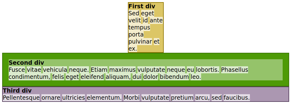
}The result appears in Figure 1.
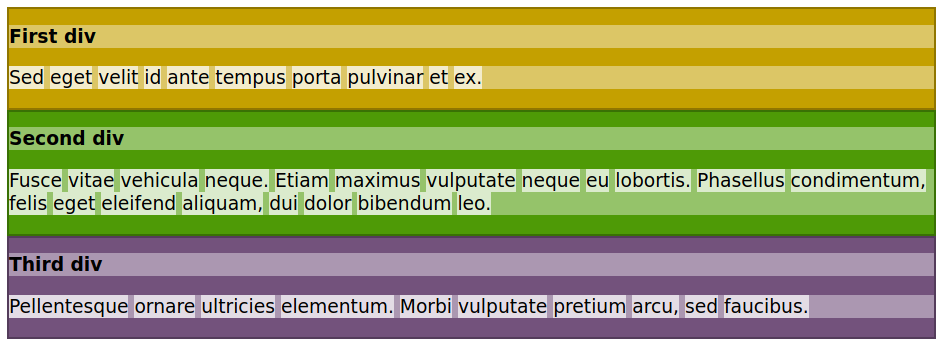
Figure 1 shows that each HTML tag has a corresponding box in the layout. The div, h2, and p elements extend to the width of their parent element. For instance, the parent element of the div elements is the body element, so they extend to the width of the body, while the parent of each h2 and p element is its corresponding div. The boxes that extend to the width of their parent element are called block elements. Some of the most common HTML tags rendered as blocks are h1, h2, h3, p, ul, ol, table, li, div, section, form, and aside. Sibling block elements — block elements sharing the same immediate parent element — are stacked inside their parent from top to bottom.
|
Note
|
Some block elements are not intended to be used as containers for other block elements. It is possible, for example, to insert a block element inside a |
Besides text itself, elements such as h1, p, and li expect only inline elements as children. Like most Western scripts, inline elements follow the left-to-right flow of text. When there is no remaining room in the right side, the flow of inline elements continues in the next line, just like text. Some common HTML tags treated as inline boxes are span, a, em, strong, img, input, and label.
In our sample HTML page, every word inside the paragraphs was surrounded by a span tag, so they could be highlighted with a corresponding CSS rule. As shown in the image, each span element is placed horizontally, from left to right, until there is no more room in the parent element.
The height of the element depends on its contents, so the browser adjusts the height of a container element to accommodate its nested block elements or lines of inline elements. However, some CSS properties affect a box’s shape, its position, and the placement of its inner elements.
The margin and padding properties affect all box types. If you do not set these properties explicitly, the browser sets some of them using standard values. As seen in Figure 1, the h2 and p elements were rendered with a gap between them. These gaps are the top and bottom margins the browser adds to these elements by default. We can remove them by modifying the CSS rules for the h2 and p selectors:
h2 {
  background-color: #ffffff66;
  margin: 0;
}

p {
  background-color: #ffffff66;
  margin: 0;
}
The result appears in Figure 2.
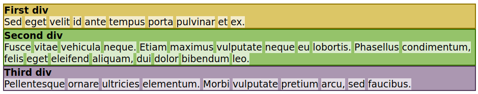
margin property can change or remove margins from elements.The body element also, by default, has a small margin that creates a gap surrounding. This gap can also be removed using the margin property.
While the margin property defines the gap between the element and its surroundings, the padding property of the element defines the internal gap between the container’s limits and its child elements. Consider the h2 and p elements inside each div in the sample code, for example. We could use their margin property to create a gap to the borders of the corresponding div, but it is simpler to change the padding property of the container:
#second {
  background-color: #4e9a06ff;
  padding: 1em;
}
Only the rule for the second div was modified, so the results (Figure 3) show the difference between the second div and the other div containers.
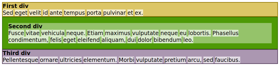
div containers can have different paddings.The margin property is a shorthand for four properties controlling the four sides of the box: margin-top, margin-right, margin-bottom, and margin-left. When margin is assigned a single value, as in the examples so far, all four margins of the box use it. When two values are written, the first defines the top and bottom margins, while the second defines the right and left margins. Using margin: 1em 2em, for example, defines a gap of 1 em for the top and bottom margins and a gap of 2 em for the right and left margins. Writing four values sets the margins for the four sides in a clockwise direction, beginning at the top. The different values in the shorthand property are not required to use the same units.
The padding property is a shorthand as well, following the same principles as the margin property.
In their default behaviour, block elements stretch to fit the available width. But this is not mandatory. The width property can set a fixed horizontal size to the box:
#first {
  background-color: #c4a000ff;
  width: 6em;
}
The addition of width: 6em to the CSS rule shrinks the first div horizontally, leaving a blank space to its right side (Figure 4).
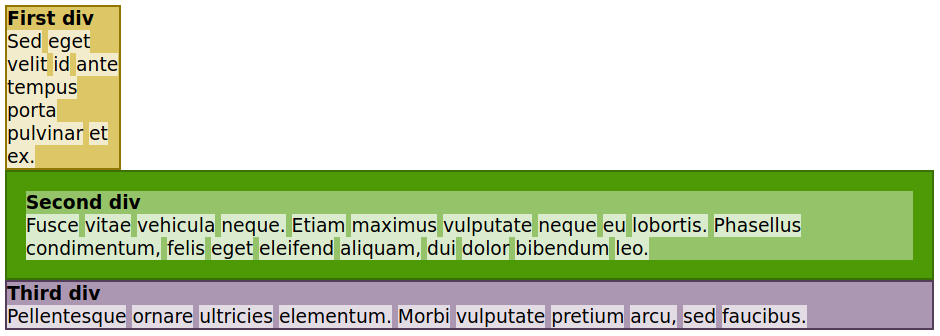
width property changes the horizontal width of the first div.Instead of leaving the first div aligned to the left, we may want to center it. Centering a box is equivalent to setting margins of the same size on both sides, so we can use the margin property to center it. The size of the available space may vary, so we use the auto value to the left and right margins:
#first {
  background-color: #c4a000ff;
  width: 6em;
  margin: 0 auto;
}
The left and right margins are automatically computed by the browser and the box will be centered (Figure 5).
margin property is used to center the first div.As shown, making a block element narrower does not make the remaining space available to the next element. The natural flow is still preserved, as if the narrower element still occupies all the available width.
Customizing Normal Flow
Normal flow is simple and sequential. CSS also lets you break normal flow and position elements in very specific ways, even overriding the scrolling of the page if you want. We’ll look at several ways to control the positioning of elements in this section.
Floating Elements
It is possible to make sibling block elements share the same horizontal space. One way to do so is through the float property, which removes the element from the normal flow. As its name suggests, the float property makes the box float over the block elements coming after, so they will be rendered as if they were under the floated box. To make the first div float to the right, add float: right to the corresponding CSS rule:
#first {
  background-color: #c4a000ff;
  width: 6em;
  float: right;
}
The automatic margins are ignored in a floated box, so the margin property can be removed. Figure 6 shows the result of the floating the first div to the right.
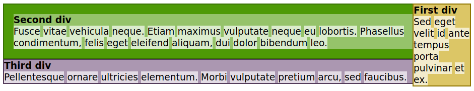
div is floating and is not part of the normal flow.By default, all block elements coming after the floated element will go under it. Therefore, given enough height, the floated box will cover all remaining block elements.
Although a floating element goes above other block elements, the inline contents inside the floating element’s container wrap around the floating element. The inspiration for this comes from magazine and newspaper layouts, which often wrap text around an image, for example.
The previous image shows how the first div covers the second div and part of the third div. Assume we want the first div to float over the second div, but not the third. The solution is to include the clear property in the CSS rule corresponding to the third div:
#third {
  background-color: #5c3566da;
  clear: right;
}
Setting the clear property to right makes the corresponding element skip any previous elements floated to the right, resuming normal flow (Figure 7).
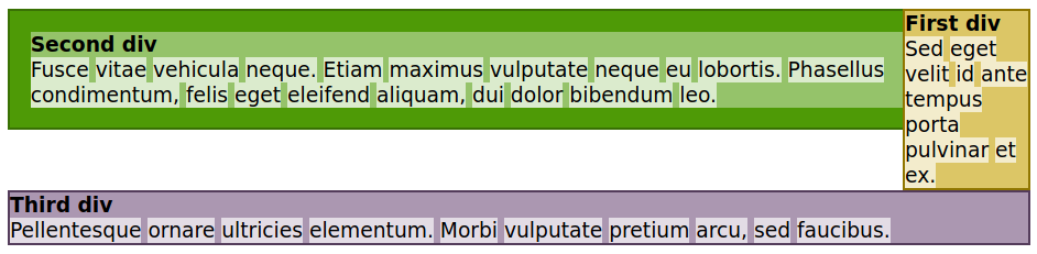
clear property returns to normal flow.Likewise, if a previous element floated to the left, you can use clear: left to resume normal flow. When you have to skip floated elements on both the left and the right, use clear: both.
Positioning Boxes
In normal flow, each box goes after the boxes coming before it in the document tree. The previous sibling elements “push” the elements coming after them, moving them to the right and downwards inside their parent element. The parent element may have its own siblings doing the same thing to it. It is like placing tiles side by side in a wall, beginning at the top.
This method of positioning the boxes is called static, and is the default value for the CSS position property. Other than defining margins and padding, there is no way to reposition a static box in the page.
Like the tiles in the wall analogy, static placement is not mandatory. As with tiles, you can place the boxes anywhere you want, even covering other boxes. To do so, assign the position property to one of the following values:
relative-
The element follows the normal flow of the document, but it can use the
top,right,bottom, andleftproperties to set offsets relative to its original static position. The offsets can also be negative. The other elements remain in their original places, as if the relative element is still static. absolute-
The element ignores the normal flow of the other elements and positions itself on the page by the
top,right,bottom, andleftproperties. Their values are relative to the document’s body or to a non-static parent container. fixed-
The element ignores the normal flow of the other elements and positions itself by the
top,right,bottom, andleftproperties. Their values are relative to the viewport (i.e., the screen area where the document is shown). Fixed elements do not move as the visitor scrolls through the document, but resemble a sticker fixed on the screen. sticky-
The element follows the normal flow of the document. However, instead of going off the viewport when the document scrolls, it will stop at the position set by the
top,right,bottom, andleftproperties. If thetopvalue is10px, for example, the element will stop scrolling under the top part of the viewport when it reaches 10 pixels from the top limit of the viewport. When that happens, the rest of the page continues to scroll, but the sticky element behaves like a fixed element in that position. It will go back to its original position when the document scroll back to its position in the viewport. Sticky elements are commonly used nowadays to create top menus that always be visible.
Positions that can use the top, right, bottom, and left properties are not required to use them all. If you set both the top and height properties of an absolute element, for example, the browser implicitly calculates its bottom property (top + height = bottom).
The display Property
If the order given by the normal flow is not an issue in your design, but you want to change how the boxes align themselves in the page, modify the display property of the element. The display property can even make the element completely disappear from the rendered document, by setting display: none. This is useful when you want to show the element later using JavaScript.
The display property can also, for example, make a block element behave like an inline element (display: inline). Doing so is not considered good practice, though. Better methods exist to place container elements side by side, such as the flexbox model.
The flexbox model was invented to overcome the limitations of floats and to eliminate the inappropriate use of tables to structure the page layout. When you set the display property of a container element to flex to turn it into a flexbox container, its immediate children will behave more or less like cells in a table row.
|
Tip
|
If you want even more control over the placement of the elements on the page, take a look at the CSS grid feature. The grid is a powerful system based on rows and columns to create elaborate layouts. |
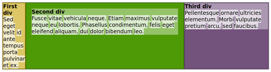
To test the flex display, add a new div element to the example page and make it the container for the three existing div elements:
<div id="container">

<div id="first">
  <h2>First div</h2>
  <p><span>Sed</span> <span>eget</span> <span>velit</span>
  <span>id</span> <span>ante</span> <span>tempus</span>
  <span>porta</span> <span>pulvinar</span> <span>et</span>
  <span>ex.</span></p>
</div><!-- #first -->

<div id="second">
  <h2>Second div</h2>
  <p><span>Fusce</span> <span>vitae</span> <span>vehicula</span>
  <span>neque.</span> <span>Etiam</span> <span>maximus</span>
  <span>vulputate</span> <span>neque</span> <span>eu</span>
  <span>lobortis.</span> <span>Phasellus</span> <span>condimentum,</span>
  <span>felis</span> <span>eget</span> <span>eleifend</span>
  <span>aliquam,</span> <span>dui</span> <span>dolor</span>
  <span>bibendum</span> <span>leo.</span></p>
</div><!-- #second -->

<div id="third">
  <h2>Third div</h2>
  <p><span>Pellentesque</span> <span>ornare</span> <span>ultricies</span>
  <span>elementum.</span> <span>Morbi</span> <span>vulputate</span>
  <span>pretium</span> <span>arcu,</span> <span>sed</span>
  <span>faucibus.</span></p>
</div><!-- #third -->


</div><!-- #container -->
Add the following CSS rule to the stylesheet to turn the container div into a flexbox container:
#container {
  display: flex;
}
The result is the three inner div elements rendered side by side (Figure 8).
Using the value inline-flex instead of flex has basically the same result, but makes the children behave more like inline elements.
Responsive Design
We know that CSS provides properties that adjust the sizes of elements and fonts relative to the available screen area. However, you may want to go further and use a different design for different devices: for example, desktop systems versus devices with screens dimensions under a certain size. This approach is called responsive web design, and CSS provides methods called media queries to make it possible.
In the previous example, we modified the page layout to place the div elements side by side in columns. That layout is suitable for larger screens, but it will be too cluttered in smaller screens. To solve this problem, we can add a media query to the stylesheet matching only screens with at least 600px in width:
@media (min-width: 600px){
  #container {
    display: flex;
  }
}
The CSS rules inside the @media directive will be used only if the criteria in parenthesis is satisfied. In this example, if the viewport width is less than 600px, the rule will not be applied to the container div and its children will be rendered as conventional div elements. The browser re-evaluates the media queries every time the viewport dimension changes, so the layout can be changed in real time while resizing the browser window or rotating the smartphone.
Guided Exercises
-
If the
positionproperty is not modified, what positioning method will be used by the browser? -
How can you make sure an element’s box will be rendered after any previously floated elements?
-
How can you use the
marginshorthand property to set the top/bottom margins to4pxand the right/left margins to6em? -
How can you horizontally center a static container element with fixed width on the page?
Explorational Exercises
-
Write a CSS rule matching the element
<div class="picture">so the text inside its following block elements settles toward its right side. -
How does the
topproperty affect a static element relative to its parent element? -
How does changing the
displayproperty of an element toflexaffect its placement in the normal flow? -
What CSS feature allows you to use a separate set of rules depending on the dimensions of the screen?
Summary
This lesson covers the CSS box model and how we can customize it. In addition to the normal flow of the document, the designer can make use of different positioning mechanisms to implement a custom layout. The lesson goes through the following concepts and procedures:
-
The normal flow of the document.
-
Adjustments to the margin and padding of an element’s box.
-
Using the float and clear properties.
-
Positioning mechanisms: static, relative, absolute, fixed and sticky.
-
Alternative values for the
displayproperty. -
Responsive design basics.
Answers to Guided Exercises
-
If the
positionproperty is not modified, what positioning method will be used by the browser?The
staticmethod. -
How can you make sure an element’s box will be rendered after any previously floated elements?
The
clearproperty of the element should be set toboth. -
How can you use the
marginshorthand property to set the top/bottom margins to4pxand the right/left margins to6em?It can be either
margin: 4px 6emormargin: 4px 6em 4px 6em. -
How can you horizontally center a static container element with fixed width on the page?
Using the
autovalue in itsmargin-leftandmargin-rightproperties.
Answers to Explorational Exercises
-
Write a CSS rule matching the element
<div class="picture">so the text inside its following block elements settles toward its right side..picture { float: left; } -
How does the
topproperty affect a static element relative to its parent element?The
topproperty does not apply to static elements. -
How does changing the
displayproperty of an element toflexaffect its placement in the normal flow?The placement of the element itself does not change, but its immediate child elements will be rendered side by side horizontally.
-
What CSS feature allows you to use a separate set of rules depending on the dimensions of the screen?
Media queries allow the browser to verify the viewport dimensions before applying a CSS rule.