032.4 Lesson 1
Certificate: |
Web Development Essentials |
|---|---|
Version: |
1.0 |
Topic: |
032 HTML Document Markup |
Objective: |
032.4 HTML Forms |
Lesson: |
1 of 1 |
Introduction
Web forms provide a simple and efficient way to request visitor information from an HTML page. The front end developer can use various components such as text fields, checkboxes, buttons, and many others to build interfaces that will send data to the server in a structured way.
Simple HTML Forms
Before jumping into markup code specific to forms, let us first start with a simple blank HTML document, without any body content:
<!DOCTYPE html>
<html lang="en">
<head>
  <meta charset="utf-8">
  <title>Working with HTML Forms</title>
</head>
<body>

<!-- The body content goes here -->

</body>
</html>
Save the code sample as a raw text file with a .html extension (as in form.html) and use your favorite browser to open it. After changing it, press the reload button in the browser to show the modifications.
The basic form structure is given by the <form> tag itself and its internal elements:
<!DOCTYPE html>
<html lang="en">
<head>
  <meta charset="utf-8">
  <title>Working with HTML Forms</title>
</head>
<body>

<!-- Form to collect personal information -->

<form>

<h2>Personal Information</h2>

<p>Full name:</p>
<p><input type="text" name="fullname" id="fullname"></p>

<p><input type="reset" value="Clear form"></p>
<p><input type="submit" value="Submit form"></p>

</form>

</body>
</html>
The double quotes are not required for single word attributes like type, so type=text works as well as type="text". The developer can choose which convention to use.
Save the new content and reload the page in the browser. You should see the result shown in Figure 1.
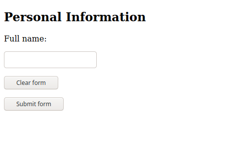
The <form> tag by itself does not produce any noticeable result on the page. The elements inside the <form>…</form> tags will define the fields and other visual aids shown to the visitor.
The example code contains both general HTML tags (<h2> and <p>) and the <input> tag, which is a form-specific tag. Whereas general tags can appear anywhere in the document, form-specific tags should be used only within the <form> element; that is, between the opening <form> and closing </form> tags.
|
Note
|
HTML provides only basic tags and properties to modify the standard appearance of forms. CSS provides elaborate mechanisms to modify the look and feel of the form, so the recommendation is to write HTML code that deals only with the functional aspects of the form and modify its appearance with CSS. |
As shown in the example, the paragraph tag <p> can be used to describe the field to the visitor. However, there is no obvious way the browser could relate the description in the <p> tag with the corresponding input element. The <label> tag is more appropriate in these cases (from now on, consider all the code samples as being inside the body of the HTML document):
<form>

<h2>Personal Information</h2>

<label for="fullname">Full name:</label>
<p><input type="text" name="fullname" id="fullname"></p>

<p><input type="reset" value="Clear form"></p>
<p><input type="submit" value="Submit form"></p>

</form>
The for attribute in the <label> tag contains the id of the corresponding input element. It makes the page more accessible, as screenreaders will be able to speak the contents of the label element when the input element is in focus. Moreover, visitors can click the label to place the focus in its corresponding input field.
The id attribute works for form elements like it does for any other element in the document. It provides an identifier for the element that is unique within the entire document. The name attribute has a similar purpose, but it is used to identify the input element in the form’s context. The browser uses the name attribute to identify the input field when sending the form data to the server, so it is important to use meaningful and unique name attributes inside the form.
The type attribute is the main attribute of the input element, because it controls the data type the element accepts and its visual presentation to the visitor. If the type attribute is not provided, by default the input shows a text box. The following input types are supported by modern browsers:
type values |
Data type | How it is displayed |
|---|---|---|
|
An arbitrary string |
N/A |
|
Text with no line breaks |
A text control |
|
Text with no line breaks |
A search control |
|
Text with no line breaks |
A text control |
|
An absolute URL |
A text control |
|
An email address or list of email addresses |
A text control |
|
Text with no line breaks (sensitive information) |
A text control that obscures data entry |
|
A date (year, month, day) with no time zone |
A date control |
|
A date consisting of a year and a month with no time zone |
A month control |
|
A date consisting of a week-year number and a week number with no time zone |
A week control |
|
A time (hour, minute, seconds, fractional seconds) with no time zone |
A time control |
|
A date and time (year, month, day, hour, minute, second, fraction of a second) with no time zone |
A date and time control |
|
A numerical value |
A text control or spinner control |
|
A numerical value, with the extra semantic that the exact value is not important |
A slider control or similar |
|
An sRGB color with 8-bit red, green and blue components |
A color picker |
|
A set of zero or more values from a predefined list |
A checkbox (offers choices and allows multiple choices to be selected) |
|
An enumerated value |
A radio button (offers choices and allows only one choice to be selected) |
|
Zero or more files each with a MIME type and optional file name |
A label and a button |
|
An enumerated value, which ends the input process and causes the form to be submitted |
A button |
|
A coordinate, relative to a particular image’s size, which ends the input process and causes the form to be submitted |
Either a clickable image or a button |
|
N/A |
A generic button |
|
N/A |
A button whose function is to reset all other fields to their initial values |
The appearance of the password, search, tel, url, and email input types do not differ from the standard text type. Their purpose is to offer hints to the browser about the intended content for that input field, so the browser or the script running on the client side can take custom actions for a specific input type. The only difference between the text input type and the password field type, for example, is that the contents of the password field are not displayed as the visitor types them in. In touch screen devices, where the text is typed with a on-screen keyboard, the browser can pop up only the numerical keyboard when an input of type tel gain focus. Another possible action is to suggest a list of known email addresses when an input of type email gain focus.
The number type also appears as a simple text input, but with increment/decrement arrows at its side. Its use will cause the numerical keyboard to show up in touchscreen devices when it has the focus.
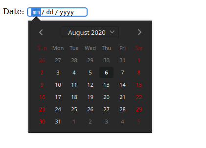
The other input elements have their own appearance and behavior. The date type, for example, is rendered according to the local date format settings and a calendar is displayed when the field gains focus:
<form>

<p>
  <label for="date">Date:</label>
  <input type="date" name="date" id="date">
</p>

</form>
Figure 2 shows how the desktop version of Firefox currently renders this field.
|
Note
|
For elements may appears slightly different in different browsers or operating systems, but their functioning and usage are always the same. |
This is a standard feature in all modern browsers and does not require extra options or programming.
Regardless of the input type, the content of an input field is called its value. All field values are empty by default, but the value attribute can be used to set a default value for the field. The value for the date type must use the YYYY-MM-DD format. The default value in the following date field in 6 August 2020:
<form>

<p>
  <label for="date">Date:</label>
  <input type="date" name="date" id="date" value="2020-08-06">
</p>

</form>
The specific input types assist the visitor in filling in the fields, but do not prevent the visitor from bypassing the restrictions and entering arbitrary values in any field. That is why it is important that the field values are validated when they arrive at the server.
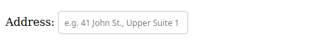
Form elements whose values must be typed by the visitor may have special attributes that assist in filling them out. The placeholder attribute inserts an example value in the input element:
<p>Address: <input type="text" name="address" id="address" placeholder="e.g. 41 John St., Upper Suite 1"></p>The placeholder appears inside the input element, as shown in Figure 3.
Once the visitor starts typing in the field, the placeholder text disappears. The placeholder text is not sent as the field value if the visitor leaves the field empty.
The required attribute requires the visitor to fill in a value for the corresponding field before submitting the form:
<p>Address: <input type="text" name="address" id="address" required placeholder="e.g. 41 John St., Upper Suite 1"></p>The required attribute is a Boolean attribute, so it can be placed alone (without the equal sign). It is important to mark the fields that are required, otherwise the visitor will not be able to tell which fields are missing and preventing the form submission.
The autocomplete attribute indicates whether the value of the input element can be automatically completed by the browser. If set to autocomplete="off", then the browser does not suggest past values to fill the entry. Input elements for sensitive information, such as credit card numbers, should have the autocomplete attribute set to off.
Input for large texts: textarea
Unlike the text field, where only one line of text can be inserted, the textarea element allows the visitor to enter more than one line of text. The textarea is a separate element, but it is not based on the input element:
<p> <label for="comment">Type your comment here:</label> <br>

<textarea id="comment" name="comment" rows="10" cols="50">
My multi-line, plain-text comment.
</textarea>

</p>
The typical appearance of a textarea is Figure 4.
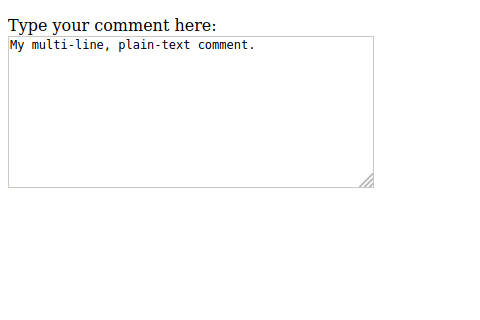
textarea element.Another difference from the input element is that the textarea element has a closing tag (</textarea>), so its content (i.e. its value) goes in between them. The rows and cols attribute do not limit the amount of text; they are used only to define the layout. The textarea also has a handle in the bottom-right corner, which allows the visitor to resize it.
Lists of Options
Several types of form controls can be used to present a list of options to the visitor: the <select> element and the radio and checkbox input types.
The <select> element is a dropdown control with a list of predefined entries:
<p><label for="browser">Favorite Browser:</label>
<select name="browser" id="browser">
<option value="firefox">Mozilla Firefox</option>
<option value="chrome">Google Chrome</option>
<option value="opera">Opera</option>
<option value="edge">Microsoft Edge</option>
</select>
</p>
The <option> tag represents a single entry in the corresponding <select> control. The entire list appears when the visitor taps or clicks over the control, as shown in Figure 5.
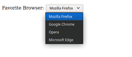
select form element.The first entry in the list is selected by default. To change this behavior, you can add the selected attribute to another entry so it will be selected when the page loads.
The radio input type is similar to the <select> control, but instead of a dropdown list, it shows all the entries so the visitor can mark one of them. Results of the following code are shown in Figure 6.
<p>Favorite Browser:</p>

<p>
	<input type="radio" id="browser-firefox" name="browser" value="firefox" checked>
  <label for="browser-firefox">Mozilla Firefox</label>
</p>

<p>
	<input type="radio" id="browser-chrome" name="browser" value="chrome">
  <label for="browser-chrome">Google Chrome</label>
</p>

<p>
	<input type="radio" id="browser-opera" name="browser" value="opera">
  <label for="browser-opera">Opera</label>
</p>

<p>
	<input type="radio" id="browser-edge" name="browser" value="edge">
  <label for="browser-edge">Microsoft Edge</label>
</p>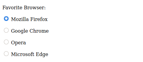
radio.Note that all the radio input types in the same group have the same name attribute. Each of them is exclusive, so the corresponding value attribute for the chosen entry will be the one associated with the shared name attribute. The checked attribute works like the selected attribute of the <select> control. It marks the corresponding entry when the page loads for the first time. The <label> tag is especially useful for radio entries, because it allows the visitor to check an entry by clicking or tapping on the corresponding text in addition to the control itself.
Whereas radio controls are intended for selecting only a single entry of a list, the checkbox input type lets the visitor check multiple entries:
<p>Favorite Browser:</p>

<p>
	<input type="checkbox" id="browser-firefox" name="browser" value="firefox" checked>
	<label for="browser-firefox">Mozilla Firefox</label>
</p>

<p>
	<input type="checkbox" id="browser-chrome" name="browser" value="chrome" checked>
	<label for="browser-chrome">Google Chrome</label>
</p>

<p>
	<input type="checkbox" id="browser-opera" name="browser" value="opera">
	<label for="browser-opera">Opera</label>
</p>

<p>
	<input type="checkbox" id="browser-edge" name="browser" value="edge">
	<label for="browser-edge">Microsoft Edge</label>
</p>
Checkboxes also can use the checked attribute to make entries selected by default. Instead of the round controls of the radio input, checkbox are rendered as square controls, as shown in Figure 7.
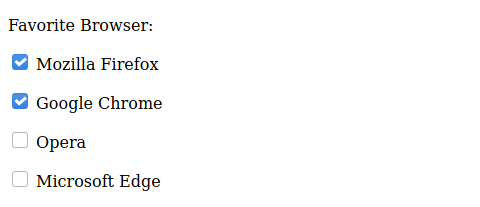
checkbox input type.If more than one entry is selected, the browser will submit them with the same name, requiring the backend developer to write specific code to properly read form data containing checkboxes.
To improve usability, input fields can be grouped together inside a <fieldset> tag:
<fieldset>
<legend>Favorite Browser</legend>

<p>
	<input type="checkbox" id="browser-firefox" name="browser" value="firefox" checked>
	<label for="browser-firefox">Mozilla Firefox</label>
</p>

<p>
	<input type="checkbox" id="browser-chrome" name="browser" value="chrome" checked>
	<label for="browser-chrome">Google Chrome</label>
</p>

<p>
	<input type="checkbox" id="browser-opera" name="browser" value="opera">
	<label for="browser-opera">Opera</label>
</p>

<p>
	<input type="checkbox" id="browser-edge" name="browser" value="edge">
	<label for="browser-edge">Microsoft Edge</label>
</p>
</fieldset>
The <legend> tag contains the text that is placed at the top of the frame the <fieldset> tag draws around the controls (Figure 8).
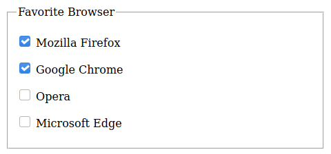
fieldset tag.The <fieldset> tag does not change how the field values are submitted to the server, but it lets the frontend developer control the nested controls more easily. For example, setting the disabled attribute in a <fieldset> attribute will make all its inner elements unavailable to the visitor.
The hidden Element Type
There are situations where the developer wants to include information in the form that cannot be manipulated by the visitor, that is, to submit a value chosen by the developer without presenting a form field where the visitor can type or change the value. The developer may want, for example, to include an identification token for that particular form that does not need to be seen by the visitor. A hidden form element is coded as in the following example:
<input type="hidden" id="form-token" name="form-token" value="e730a375-b953-4393-847d-2dab065bbc92">The value of a hidden input field is usually added to the document at the server side, when rendering the document. Hidden inputs are treated like ordinary fields when the browser sends them to the server, which also reads them as ordinary input fields.
The File Input Type
In addition to textual data, either typed or selected from a list, HTML forms can also submit arbitrary files to the server. The file input type lets the visitor pick a file from the local file system and send it directly from the web page:
<p>
<label for="attachment">Attachment:</label><br>
<input type="file" id="attachment" name="attachment">
</p>
Instead of a form field to write in or select a value from, the file input type shows a browse button that will open a file dialog. Any file type is accepted by the file input type, but the backend developer will probably restrict the allowed file types and their maximum size. The file type verification can also be performed in the frontend by adding the accept attribute. To accept only JPEG and PNG images, for example, the accept attribute should be accept="image/jpeg, image/png".
Action Buttons
By default, the form is submitted when the visitor presses the Enter key at any input field. To make things more intuitive, a submit button should be added with the submit input type:
<input type="submit" value="Submit form">
The text in the value attribute is displayed on the button, as shown in Figure 9.

Another useful button to include in complex forms is the reset button, which clears the form and returns it to its original state:
<input type="reset" value="Clear form">Like the submit button, the text in the value attribute is used to label the button. Alternatively, the <button> tag can be used to add buttons to forms or anywhere else in the page. Unlike buttons made with the <input> tag, the button element has a closing tag and the button label is their inner content:
<button>Submit form</button>When inside a form, the default action for the button element is to submit the form. Like the input buttons, the button’s type attribute can be switched to reset.
Form Action and Methods
The last step in writing an HTML form is to define how and to where the data should be sent. These aspects depend on details in both the client and the server.
On the server side, the most common approach is to have a script file that will parse, validate, and process the form data according to the application’s purpose. For example, the backend developer could write a script called receive_form.php to receive the data sent from the form. On the client side, the script is indicated in the action attribute of the form tag:
<form action="receive_form.php">The action attribute follows the same conventions as all HTTP addresses. If the script is in the same hierarchy level of the page containing the form, it can be written without its path. Otherwise, the absolute or the relative path must be supplied. The script should also generate the response to serve as a landing page, loaded by the browser after the visitor submits the form.
HTTP provides distinct methods for sending form data through a connection with the server. The most common methods are get and post, which should be indicated in the method attribute of the form tag:
<form action="receive_form.php" method="get">Or:
<form action="receive_form.php" method="post">In the get method, the form data is encoded directly in the request URL. When the visitor submits the form, the browser will load the URL defined in the action attribute with the form fields appended to it.
The get method is preferred for small amounts of data, such as simple contact forms. However, the URL cannot exceed a few thousands characters, so the post method should be used when forms contain large or non-textual fields, like images.
The post method makes the browser send the form data in the body section of the HTTP request. While necessary for binary data that exceeds the size limit of a URL, the post method adds unnecessary overhead to the connection when used in simpler textual forms, so the get method is preferred in such cases.
The chosen method does not affect how the visitor interacts with the form. The get and post methods are processed differently by the server-side script that receives the form.
When using the post method, it is also possible to change the MIME type of the form contents with enctype form attribute. This affects how the form fields and values will be stacked together in the HTTP communication with the server. The default value for enctype is application/x-www-form-urlencoded, which is similar to the format used in the get method. If the form contains input fields of type file, the enctype multipart/form-data should be used instead.
Guided Exercises
-
What is the correct way to associate a
<label>tag to an<input>tag? -
What input element type provides a slider control to pick a numerical value?
-
What is the purpose of the
placeholderform attribute? -
How could you make the second option in a select control selected by default?
Explorational Exercises
-
How could you change a file input to make it accept only PDF files?
-
How could you inform the visitor about which fields in a form are required?
-
Put together three code snippets in this lesson in a single form. Make sure not to use the same
nameoridattribute in multiple form controls.
Summary
This lesson covers how to create simple HTML forms to send data back to the server. At the client side, HTML forms consist of standard HTML elements that are combined to build custom interfaces. Moreover, forms must be configured to properly communicate with the server. The lesson goes through the following concepts and procedures:
-
The
<form>tag and basic form structure. -
Basic and special input elements.
-
The role of special tags like
<label>,<fieldset>and<legend>. -
Form buttons and actions.
Answers to Guided Exercises
-
What is the correct way to associate a
<label>tag to an<input>tag?The
forattribute of the<label>tag should contain the id of the corresponding<input>tag. -
What input element type provides a slider control to pick a numerical value?
The
rangeinput type. -
What is the purpose of the
placeholderform attribute?The
placeholderattribute contains an example of visitor input that is visible when the corresponding input field is empty. -
How could you make the second option in a select control selected by default?
The second
optionelement should have theselectedattribute.
Answers to Explorational Exercises
-
How could you change a file input to make it accept only PDF files?
The
acceptattribute of the input element should set toapplication/pdf. -
How could you inform the visitor about which fields in a form are required?
Usually, the required fields are marked with an asterisk (
*), and a brief note like “Fields marked with * are required” is placed close to the form. -
Put together three code snippets in this lesson in a single form. Make sure not to use the same
nameoridattribute in multiple form controls.<form action="receive_form.php" method="get"> <h2>Personal Information</h2> <label for="fullname">Full name:</label> <p><input type="text" name="fullname" id="fullname"></p> <p> <label for="date">Date:</label> <input type="date" name="date" id="date"> </p> <p>Favorite Browser:</p> <p> <input type="checkbox" id="browser-firefox" name="browser" value="firefox" checked> <label for="browser-firefox">Mozilla Firefox</label> </p> <p> <input type="checkbox" id="browser-chrome" name="browser" value="chrome" checked> <label for="browser-chrome">Google Chrome</label> </p> <p> <input type="checkbox" id="browser-opera" name="browser" value="opera"> <label for="browser-opera">Opera</label> </p> <p> <input type="checkbox" id="browser-edge" name="browser" value="edge"> <label for="browser-edge">Microsoft Edge</label> </p> <p><input type="reset" value="Clear form"></p> <p><input type="submit" value="Submit form"></p> </form>