033.3 Lesson 1
Certificate: |
Web Development Essentials |
|---|---|
Version: |
1.0 |
Topic: |
033 CSS Content Styling |
Objective: |
033.3 CSS Styling |
Lesson: |
1 of 1 |
Introduction
CSS provides hundreds of properties that can be used to modify the appearance of HTML elements. Only experienced designers manage to remember most of them. Nevertheless, it is practical to know the basic properties that are applicable to any element, as well as some element-specific properties. This chapter covers some popular properties you are likely to use.
CSS Common Properties and Values
Many CSS properties have the same value type. Colors, for example, have the same numerical format whether you are changing the font color or the background color. Similarly, the units available to change the size of the font are also used to change the thickness of a border. However, the format of the value is not always unique. Colors, for example, can be entered in various different formats, as we will see next.
Colors
Changing the color of an element is probably one of the first things designers learn to do with CSS. You can change the color of the text, the background color, the color of the border of elements, and more.
The value of a color in CSS can be written as a color keyword (i.e. a color name) or as a numerical value listing each color component. All common color names, such as black, white, red, purple, green, yellow, and blue are accepted as color keywords. The entire list of color keywords accepted by CSS is available at a W3C web page. But to have finer control over the color, you can use the numerical value.
Color Keywords
We’ll use the color keyword first, because it’s simpler. The color property changes the color of the text in the corresponding element. So to put all the text on the page in purple, you could write the following CSS rule:
* {
  color: purple;
}
Numerical Color Values
Although intuitive, color keywords do not offer the complete range of possible colors in modern displays. Web designers usually develop a color palette that employs custom colors, by assigning specific values to the red, green, and blue components.
Each color component is an eight-bit binary number, ranging from 0 to 255. All three components must be specified in the color mixture, and their order is always red, green, blue. Therefore, to change the color for all the text in the page to red using RGB notation, use rgb(255,0,0):
* {
  color: rgb(255,0,0);
}
A component set to 0 means that the corresponding basic color is not used in the color mixture. Percentages can also be used instead of numbers:
* {
  color: rgb(100%,0%,0%);
}
The RGB notation is rarely seen if you use a drawing application to create layouts or just to pick its colors. Rather, it is more common to see colors in CSS expressed as hexadecimal values. The color components in hexadecimal also range from 0 to 255, but in a more succinct way, starting with a hash symbol # and using a fixed two-digit length for all components. The minimal value 0 is 00 and the maximum value 255 is FF, so the color red is #FF0000.
|
Tip
|
If the digits in each component of a hexadecimal color repeat, the second digit can be omitted. The color |
The following list shows the RGB and hexadecimal notation for some basic colors:
| Color Keyword | RGB Notation | Hexadecimal Value |
|---|---|---|
|
|
|
|
|
|
|
|
|
|
|
|
|
|
|
|
|
|
|
|
|
Color keywords and the letters in hexadecimal color values are case-insensitive.
Color Opacity
In addition to opaque colors, it is possible to fill page elements with semi-transparent colors. The opacity of a color can be set using a fourth component in the color value. Unlike the other color components, where the values are integer numbers ranging from 0 to 255, the opacity is a fraction ranging from 0 to 1.
The lowest value, 0, results in a completely transparent color, making it undistinguishable from any other fully transparent color. The highest value, 1, results in a fully opaque color, which is the same as the original color with no transparency at all.
When you use the RGB notation, specify colors with an opacity component through the rgba prefix instead of rgb. Thus, to make the color red half-transparent, use rgba(255,0,0,0.5). The a character stands for alpha channel, a term commonly used to specify the opacity component in digital graphics jargon.
The opacity can also be set in the hexadecimal notation. Here, like the other color components, the opacity ranges from 00 to FF. Therefore, to make the color red half-transparent using hexadecimal notation, use #FF000080.
Background
The background color of single elements or of the entire page is set with the background-color property. It takes the same values as the color property, either as keywords or using the RGB/hexadecimal notation.
The background of HTML elements is not restricted to colors, though. With the background-image property it is possible to use an image as the background. The accepted image formats are all the conventional ones accepted by the browser, such as JPEG and PNG.
The path to the image should be specified using an url() designator. If the image you want to use is in the same folder as the HTML file, it is enough to use only its filename:
body {
background-image: url("background.jpg");
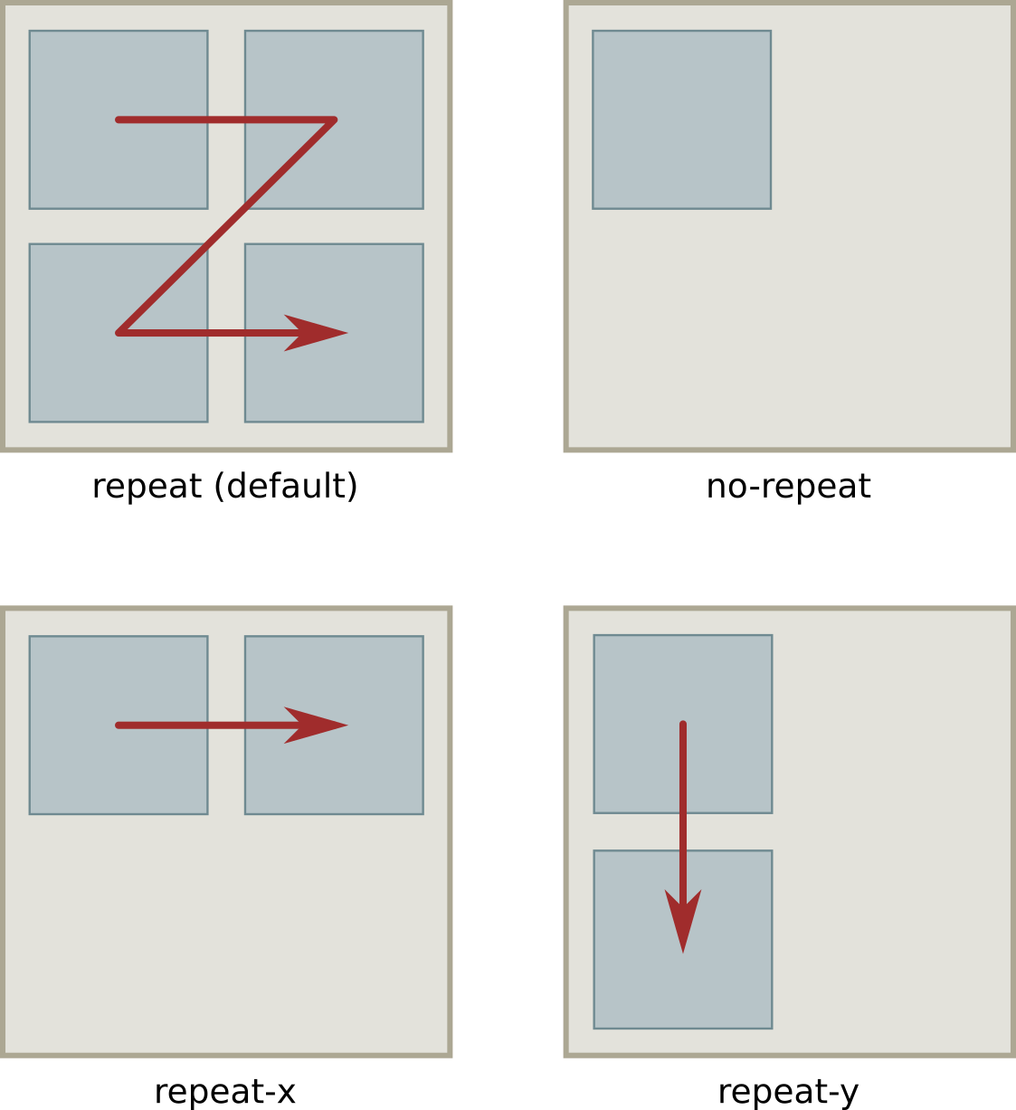
}In this example, the background.jpg image file will be used as the background image for the entire body of the page. By default, the background image is repeated if its size does not cover the entire page, starting from the top-left corner of the area corresponding to the rule’s selector. This behavior can be modified with the background-repeat property. If you want the background image to be placed in the element’s area without repeating it, use the no-repeat value:
body {
  background-image: url("background.jpg");
  background-repeat: no-repeat;
}
You can also make the image repeat only in the horizontal direction (background-repeat: repeat-x) or only in the vertical direction (background-repeat: repeat-y).
background-repeat property.|
Tip
|
Two or more CSS properties can be combined in a single property, called the background shorthand property. The |
A background image can also be placed in a specific position in the element’s area using the background-position property. The five basic positions are top, bottom, left, right and center, but the top-left position of the image can also be adjusted with percents:
body {
  background-image: url("background.jpg");
  background-repeat: no-repeat;
  background-position: 30% 10%;
}
The background-position is measured from the edges of the containing element, which in this example is the entire body of the page. The position can be specified in exact units (for instance 1em) or as a percentage of the containing element. In this example, therefore, the background image will start 30% of the body’s width from the left side of the body and 10% of the body’s height from the top of the body.
Borders
Changing an element’s border is also a common layout customization made with CSS. The border refers to the line forming a rectangle around the element and has three basic properties: color, style and width.
The color of the border, defined with border-color, follows the same format we saw for the other color properties.
Borders can be traced in a style other than a solid line. You could, for example, use dashes for the border with the property border-style: dashed. The other possible style values are:
dotted-
A sequence of rounded dots
double-
Two straight lines
groove-
A line with a carved appearance
ridge-
A line with an extruded appearance
inset-
An element that appears embedded
outset-
An element that appears embossed
The border-width property set the thickness of the border. Its value can be a keyword (thin, medium or thick) or a specific numerical value. If you prefer to use a numerical value, you will also need to specify its corresponding unit. This is described next.
Unit Values
Sizes and distances in CSS can be defined in various ways. Absolute units are based on a fixed number of screen pixels, so they are not so different from the fixed sizes and dimensions used in printed media. There are also relative units, which are dynamically calculated from some measurement given by the media where the page is being rendered, like the available space or another size written in absolute units.
Absolute Units
Absolute units are equivalent to their physical counterparts, like centimeters or inches. On conventional computer screens, one inch will be 96 pixels wide. The following absolute units are commonly used:
in(inch)-
1 in is equivalent to 2.54 cm or 96 px.
cm(centimeter)-
1 cm is equivalent to 96 px / 2.54.
mm(millimeter)-
1 mm is equivalent to 1 cm / 10.
px(pixel)-
1 px is equivalent to 1 / 96th of an inch.
pt(point)-
1pt is equivalent to 1 / 72th of an inch.
Keep in mind that the ratio of pixels to inch may vary. In high resolution screens, where pixels are more densely packed, an inch will correspond to more than 96 pixels.
Relative Units
Relative units vary according to other measurements or to the viewport dimensions. The viewport is the area of the document currently visible in its window. In full screen mode, the viewport corresponds to the device screen. The following relative units are commonly used:
%-
Percentage — it is relative to the parent element.
em-
The size of the font used in the element.
rem-
The size of the font used in the root element.
vw-
1% of the viewport’s width.
vh-
1% of the viewport’s height.
The advantage of using relative units is that you can create layouts that are adjustable by changing only a few key sizes. For example, you can use the pt unit to set the font size in the body element and the rem unit for the fonts in other elements. Once you change the size of font for the body, all the other font sizes will adjust accordingly. Furthermore, using vw and vh to set the dimensions of page sections makes them adjustable to screens with different sizes.
Fonts and Text Properties
Typography, or the study of font types, is a very broad design subject, and CSS typography does not lag behind. However, there are a few basic font properties that will meet the needs of most users learning CSS.
The font-family property sets the name of the font to be used. There is no guarantee that the chosen font will be available in the system where the page will be viewed, so this property may have no effect in the document. Although it is possible to make the browser download and use the specified font file, most web designers are happy using a generic font family in their documents.
The three most common generic font families are serif, sans-serif and monospace. Serif is the default font family in most browsers. If you prefer to use sans-serif for the entire page, add the following rule to your stylesheet:
* {
  font-family: sans-serif;
}
Optionally, you can first set a specific font family name, followed by the generic family name:
* {
  font-family: "DejaVu Sans", sans-serif;
}
If the device rendering the page has that specific font family, the browser will use it. If not, it will use its default font matching the generic family name. Browsers search for fonts in the order they are specified in the property.
Anyone who has used a word processing application will also be familiar with three other font adjustments: size, weight, and style. These three adjustments have CSS properties counterparts: font-size, font-weight, and font-style.
The font-size property accepts keyword sizes such as xx-small, x-small, small, medium, large, x-large, xx-large, xxx-large. These keywords are relative to the default font size used by the browser. The keywords larger and smaller change the font size relative to the parent’s element font size. You can also express the font size with numerical values, including the unit after the value, or with percentages.
If you do not want to change the font size, but the distance between lines, use the line-height property. A line-height of 1 will make the line height the same size of the font of the element, which can make the text lines too close together. Therefore, a value greater than 1 is more appropriate for texts. Like the font-size property, other units can be used together with the numerical value.
The font-weight sets the thickness of the font with the familiar keywords normal or bold. The keywords lighter and bolder change the font weight of the element relative to the font weight of its parent element.
The font-style property can be set to italic to select the italic version of the current font family. The oblique value selects the oblique version of the font. These two options are almost identical, but the italic version of a font is usually a little more narrow than the oblique version. If neither italic nor oblique versions of the font exist, the font will be artificially tilted by the browser.
There are other properties that change the way text is rendered in the document. You can, for example, add an underline to some parts of the text you want to emphasize. First, use a <span> tag to delimit the text:
<p>CSS is the <span class="under">proper mechanism</span> to style HTML documents.</p>Then you can use the .under selector to change the text-decoration property:
.under {
  text-decoration: underline;
}
By default, all a (link) elements are underlined. If you want to remove it, use the none value for the text-decoration of all a elements:
a {
  text-decoration: none;
}
When reviewing content, some authors like to cross out incorrect or outdated parts of the text, so that the reader will know the text has been updated and what has been removed. To do so, use the line-through value of the text-decoration property:
.disregard {
  text-decoration: line-through;
}
Again, a <span> tag can be used to apply the style:
<p>Netscape Navigator <span class="disregard">is</span> was one of the most popular Web browsers.</p>Other decorations may be specific to an element. The circles in bullet point lists can be customized using the list-style-type property. To change them to squares, for example, use list-style-type: square. To simply remove them, set the value of list-style-type to none.
Guided Exercises
-
How could you add half-transparency to the color blue (RGB notation
rgb(0,0,255)) in order to use it in the CSScolorproperty? -
What color corresponds to the
#000hexadecimal value? -
Given that
Times New Romanis aseriffont and that it will not be available in all devices, how could you write a CSS rule to requestTimes New Romanwhile setting theserifgeneric font family as a fallback? -
How could you use a relative size keyword to set the font size of the element
<p class="disclaimer">smaller in relation to its parent element?
Explorational Exercises
-
The
backgroundproperty is a shorthand to set more than onebackground-*property at once. Rewrite the following CSS rule as a singlebackgroundshorthand property.body { background-image: url("background.jpg"); background-repeat: repeat-x; } -
Write a CSS rule for the element
<div id="header"></div>that changes only its bottom border width to4px. -
Write a
font-sizeproperty that doubles the font size used in the page’s root element. -
Double-spacing is a common text formatting feature in word processors. How could you set a similar format using CSS?
Summary
This lesson covers the application of simple styles to elements of an HTML document. CSS provides hundreds of properties, and most web designers will need to resort to reference manuals to remember them all. Nonetheless, a relatively small set of properties and values are used most of the time, and it is important to know them by heart. The lesson goes through the following concepts and procedures:
-
Fundamental CSS properties dealing with colors, backgrounds, and fonts.
-
The absolute and relative units CSS can use to set sizes and distances, such as
px,em,rem,vw,vh, etc.
Answers to Guided Exercises
-
How could you add half-transparency to the color blue (RGB notation
rgb(0,0,255)) in order to use it in the CSScolorproperty?Use the
rgbaprefix and add0.5as the fourth value:rgba(0,0,0,0.5). -
What color corresponds to the
#000hexadecimal value?The color
black. The#000hexadecimal value is a shorthand for#000000. -
Given that
Times New Romanis aseriffont and that it will not be available in all devices, how could you write a CSS rule to requestTimes New Romanwhile setting theserifgeneric font family as a fallback?* { font-family: "Times New Roman", serif; } -
How could you use a relative size keyword to set the font size of the element
<p class="disclaimer">smaller in relation to its parent element?Using the
smallerkeyword:p.disclaimer { font-size: smaller; }
Answers to Explorational Exercises
-
The
backgroundproperty is a shorthand to set more than onebackground-*property at once. Rewrite the following CSS rule as a singlebackgroundshorthand property.body { background-image: url("background.jpg"); background-repeat: repeat-x; }body { background: repeat-x url("background.jpg"); } -
Write a CSS rule for the element
<div id="header"></div>that changes only its bottom border width to4px.#header { border-bottom-width: 4px; } -
Write a
font-sizeproperty that doubles the font size used in the page’s root element.The
remunit corresponds to the font size used in the root element, so the property should befont-size: 2rem. -
Double-spacing is a common text formatting feature in word processors. How could you set a similar format using CSS?
Set the
line-heightproperty to the value2em, because theemunit corresponds to the font size of the current element.